
We have a duty to be responsible and inclusive with accessibility. Mateusz reveals the top 7 mistakes and what to do about them :)
Innerworks is coming soon...
This blog was originally published on our previous Cogworks blog page. The Cogworks Blog is in the process of evolving into Innerworks, our new community-driven tech blog. With Innerworks, we aim to provide a space for collaboration, knowledge-sharing, and connection within the wider tech community. Watch this space for Innerworks updates, but don't worry - you'll still be able to access content from the original Cogworks Blog if you want.
Hello, I'm Mateusz, a QA engineer at Cogworks!
Accessibility is an integral part of a website, so the QA testing process has to be on-point. Here are seven common mistakes to watch out for:
1. Insufficient colour contrast.
This is the most common error found in applications and websites.
Generally, we can divide accessibility problems into three levels (WCAG 2.1): A, AA or AAA.
The AA level requires a minimum contrast ratio of 4.5:1 for standard text (14pt or 18pt, depending on the font weight) and 3:1 for large text (bold or 14pt+). This level is considered the minimum requirement for accessibility.
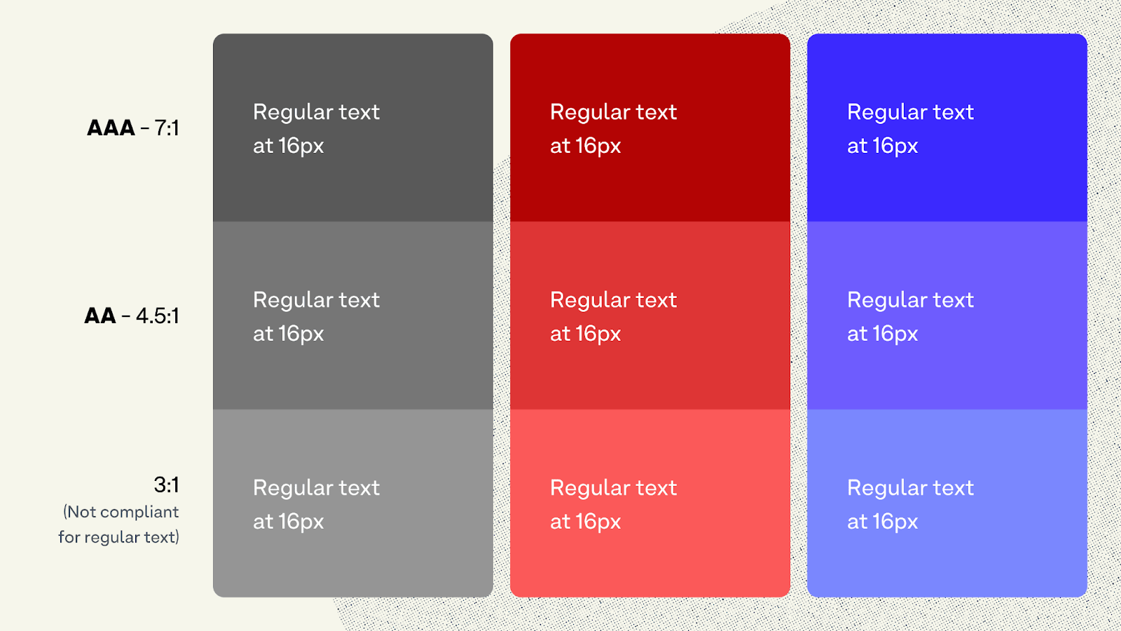
Image source: Accessible contrast ratios and A-levels explained
The AAA level requires a higher contrast ratio of 7:1 for standard text and 4.5:1 for large text. Meeting the AAA level provides a higher degree of accessibility.
These guidelines should be followed to a tee from the design, UI and QA phases to avoid costly repairs later on down the line. Often large organisations predetermine a brand's colours before branching out to various digital projects, so if getting to the QA of a website, so if they don't meet the AAA guidelines, these cannot be easily changed at the QA phase.
Recommended tools: Contrast plugin by Figma, Axe-core and the built-in DevTools available in your browser.
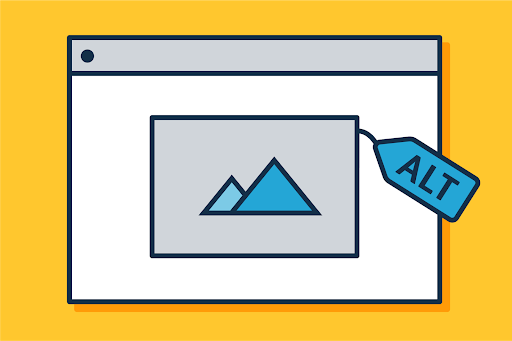
2. Missing alternative text.
ALT-text is used to give additional context to photos for users, but it's important to mention that it isn't always necessary. If an image has a decorative role, it doesn't add information about the content of a page; it is simply there to make the website more visually attractive.
Testing for missing alt text isn't enough on its own; testers need to be aware of the latest web accessibility guidelines to judge whether an image is decorative, informative, or otherwise.
The Web Accessibility Initiative give more information on how to use alt-text on different types of images!
What to do about it:
Testing for accessibility can be done automatically (with tools like Axe-Core or Playwright) or manually. We use a mix of automation and manual testing at Cogworks. I prefer to use a plugin, User JavaScript and CSS, which allows you to easily add your own JS or CSS scripts to images where alt texts are missing.
In the picture below, the code underneath the two images is the CCS, which points to the image lacking alternative text.
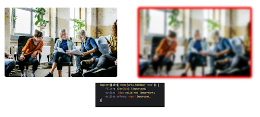
On the first line in the pop-up, the code reads "img:not([alt]):not", which tells us that alternative text is missing; what's great is the image that lacks alternative text is blurred out, and a red border is applied so the user can easily detect which image lacks alternative text!
It's important to remember that there can still be Alt-text mistakes, even with the User JavaScript and CSS plugin in your toolkit!
Help your user understand every element on a page.
Sometimes images fail to load, so it's vital to every user an understanding of what is happening on that page!
Source: What's the alternative? How to write good alt text, Gov. uk
I had experienced times in my career when developers used a background image instead of a stock photo because it was a more straightforward solution.
Still, it did not have an alt-text tag where it was required!
We must pay attention to alt-text because they help identify the functions of the photo for visually impaired people who may rely on a voice reader. The following sentences are proper, but which sentence describes the picture below more accurately?
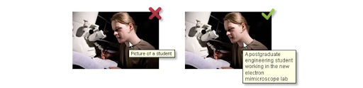
Image source: Accessibility testing, schmaltzitup.com.
1. Picture of a student
2. A postgraduate engineering student is working in the new electron microscope lab
You can see why good alt text helps everyone understand the whole picture!
3. Keyboard inaccessibility.
Keyboard inaccessibility refers to issues preventing users from navigating and interacting with a website or application using only a keyboard or keyboard-like device. It is a common accessibility issue that can exclude individuals with motor disabilities, specific visual impairments, or those who rely on keyboard navigation.
Here are a few points that must be met for the A and AA standards for the site to be fully functional:
Success Criterion 2.1.1 Keyboard (Level A) - All content functionality is operable through a keyboard interface without requiring specific timings for individual keystrokes.
Success Criterion 2.1.2 No Keyboard Trap (Level A) ensures that keyboard users can navigate through all interactive elements and controls without getting stuck or trapped in a specific area!
Success Criterion 2.4.3 Focus Order (Level A) -The sequence of keyboard focus among interactive elements follows a meaningful order that preserves the meaning and operability of the content. This ensures that the keyboard focus moves through the interactive features logically and intuitively.
Success Criterion 2.4.7 Focus Visible (Level AA): Any keyboard-focused element should have a visible indication of focus. This helps users with visual impairments or cognitive disabilities quickly identify the part they interact with when navigating the keyboard.
What to do about it:
No fancy automation tools here. Go through the keyboard test manually, going through the entire page using just the keyboard.
4. Lack of heading structure.
The lack of a heading structure is a common accessibility issue, and it can be addressed under the Web Content Accessibility Guidelines (WCAG) at the AA level.
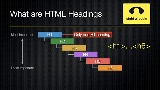
Source: Why headings are essential for accessibility.
Headings are crucial in organizing content and providing a logical structure to web pages.
Using proper heading markup (such as <h1>, <h2>, <h3>, etc.) helps assistive technologies and users navigate and understand the content more easily. It also improves the overall user experience and readability for everyone.
The easiest way to test it is to use the HeadingsMap Chrome extension, as it helps you quickly visualize and navigate the heading hierarchy of a webpage.
It provides an outline of the headings used on the page, allowing you to assess the logical organization and structure of the content. This benefits individuals relying on screen readers or keyboard navigation to understand and navigate web pages!
5. Inadequate link descriptions.
Inadequate link descriptions occur when links are not descriptive enough to convey their purpose or destination to users.
Instead of using generic terms like "click here" or "read more," descriptive link text must be used to provide meaningful information about the linked content. This allows users, particularly those who rely on assistive technologies, to understand the purpose and destination of the link without having to rely on additional context.
What to do about it:
The simplest solution would be to use Lighthouse from Google but to ensure everything works properly, use screen readers such as NVDA for Windows or built-in macOS.
6. Inaccessible multimedia.
Inaccessible multimedia refers to audio or video content that is not accessible to individuals with disabilities.
It can include missing captions, lack of audio descriptions, or the absence of alternative formats for users needing multimedia content access. Several points must be met:
Captions (AA): require that prerecorded synchronized media, such as videos, have captions or an alternative text-based presentation for audio content. Captions provide a text representation of the audio content, allowing users who are deaf or hard of hearing to understand the information presented in the multimedia.
Audio Descriptions (AA) that prerecorded video content with audio must have an additional audio description track that describes important visual information not conveyed through the main soundtrack. Audio descriptions enable users who are blind or have low vision to understand the visual aspects of multimedia content.
Media Alternative (AA): address the need for an alternative multimedia content version. This alternative version should be accessible and convey the same information as the original media. It allows users who cannot access the original multimedia to obtain relevant information to do about it:
A manual testing approach is the best. It's good to imagine how it is for a person with a disability and try to simulate how she perceives it and go through the whole process of using the media.
7. Inaccessible forms.
Inaccessible forms aren't accessibility bugs, but it's important enough to be included in this list! Here are a few of the most critical errors in the forms:
Missing or inadequate labelling: Properly label form elements to help users understand their purpose, especially for screen reader users and individuals with cognitive disabilities.
Lack of form field focus: Provide clear visual indication or focus states on form fields, highlighting the currently focused area to assist keyboard users in navigating the form.
Poor error handling: Display descriptive error messages near form fields when users submit the form with errors, guiding them on correcting the issues.
Unintuitive form structure: Create a logical and consistent form structure by grouping related fields and using proper sequencing to enhance user understanding and flow.
Non-compliant validation: Implement form validation that goes beyond visual cues, providing alternative or additional textual alerts to ensure users with visual impairments can perceive and understand validation errors.
Inaccessible error summaries: Include an accessible error summary at the top of the form, clearly indicating the number of errors and providing links or instructions to fields with errors for efficient error correction.
Unresponsive form design: Ensure that forms are responsive and adaptable to different screen sizes and devices, improving usability for users accessing the form on mobile devices or with limited screen real estate.
That's it for now.
I hope you liked my round-up of the seven most common accessibility issues.
By investing in accessibility testing, you not only enhance the user experience but also demonstrate your commitment to inclusivity.
If you want to know how you can make your website more accessible, get in touch with our friendly team,
Mateusz.